A HOTEL’S RESTAURANT BRANDING CASE STUDY

Ovac Restaurant

The Story

Cavo Tagoo Santorini is one of the most iconic luxury hotels in Greece. Having established a firm presence on the island of Mykonos, the owners of Cavo Tagoo transformed an authentic Cycladic property in Santorini into an exceptional hotel that evokes the same unpretentious style and cosmopolitan essence. Like the world-favored hotel in Mykonos, Cavo Tagoo in Santorini is also an idyllic place for seekers of thrilling experiences and a dream honeymoon destination.

At the hotel’s restaurant, which boasts jaw-dropping views of the caldera and out to the blue Aegean Sea, guests can choose from a sensational menu of Mediterranean fusion cuisine.

The Challenge

As a new player in the gastronomy scene of Santorini, this amazing restaurant required a brand name and logo development. What he had to do was pretty clear:

  • We had to come up with a distinctive name, that would be as classy as the restaurant itself.
  • The new name had to be turned into a logo that would be visually connected to its parent brand, Cavo Tagoo.
  • We were also assigned to create the restaurant menus and business cards, along with a print ad to increase awareness.

Brand Naming

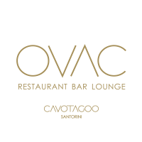
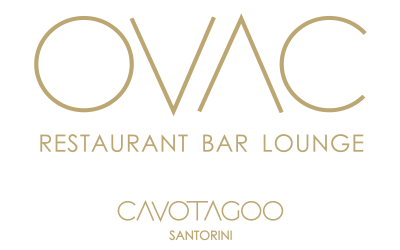
Finding a name for Cavo Tagoo’s restaurant was not an easy task. An ideal brand name is simple to understand and memorable. It took us many brainstorming sessions until the idea hit us like a ton of bricks: reversing the brand name of the world-renowned hotel resulted in a visually-appealing logo that evokes all the sophisticated quality and elegance of the restaurant.

The logo of Ovac had to remain visually connected to that of Cavo Tagoo Santorini. This is why we used the same thin font that offers a delicate and elegant feel. The application of the logo on the menus of Ovac speaks for itself.

Restaurant Menus

For the menus of Ovac we strictly used excellent quality materials. The golden laminated paper was undoubtedly the perfect choice for such a prestigious project! Our work resulted in three meticulously designed, hardcover menus in different combinations of gold and white.

Print Ad

A successful print ad draws attention and stops the reader from turning the page. We used a gold texture background to catch the eye and to be in line with the menus of Ovac.

× espa