Objective & Challenge
Inspired by the timeless Homeric tale of Odysseus, Odyssey Rock sought a brand identity that would reflect its philosophy of journey, discovery, and hospitality. Located on the beloved island of Milos, the challenge was to craft a distinctive identity in a highly competitive tourism market, ensuring immediate recognition and long-term memorability.
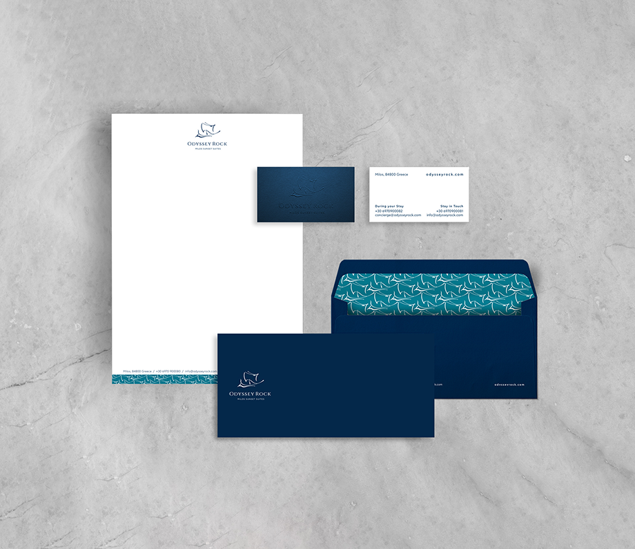
Strategy & Creativity
Drawing from the myth of Odysseus and the natural beauty of Milos, we designed a logo featuring an archaic ship — a symbol of adventure and resilience. Blue was chosen as the primary color, paired with stone textures referencing Milos’ iconic rock formations. This visual language extended into a cohesive brand system, including elegant patterns, printed materials, and guest touchpoints, all reinforcing the hotel’s narrative of timeless hospitality.
Implementation & Results
The unified aesthetic gave Odyssey Rock a strong foundation for brand awareness and guest engagement. From stationery and souvenirs to an elegant treat box for guests, every detail embodied the brand’s philosophy. The digital presence was equally refined: a responsive website with clean navigation, inspired copywriting, and carefully selected fonts communicated the accommodation’s vision with clarity and warmth.
This holistic approach earned INK Design an Award in Branding at the Indie Awards 2025, recognizing excellence in hospitality identity design.
__________
Every award is a story of collaboration, vision, and impact. They remind us that design is not just about aesthetics, but about shaping experiences that resonate deeply.