Objective & Challenge
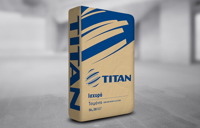
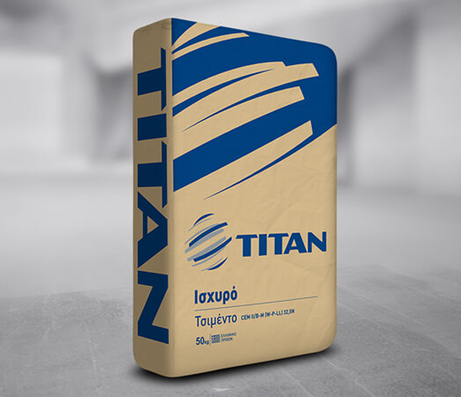
TITAN, the leading producer of cement and construction materials, commissioned INK Design to create innovative packaging for its cement bags. The goal was to communicate a clear message of superiority and differentiation while maintaining the prestige of the brand. The challenge lay in designing packaging that distinguished products from one another, yet unified them under a cohesive identity that reinforced TITAN’s corporate strength.
Strategy & Creativity
Guided by market research, focus groups, and international benchmarking, we developed a range of proposals — some bold, others evolving from existing designs. The strategy emphasized vibrant colors, simplicity, and prestige. By enlarging and foregrounding the TITAN logo, the design radiates robustness, seriousness, and confidence. The word TITAN itself became the central visual element, requiring no unnecessary embellishments.
Implementation & Results
The final packaging design used distinct colors for each product, ensuring easy differentiation even when bags were stacked on pallets. Bright tones boosted recognition, reinforced branding, and communicated excellence. Careful attention was given to technical details during production, guaranteeing flawless execution.
This impactful design earned INK Design an Award in Packaging Design at the Indie Awards 2021, recognizing excellence in industrial packaging and brand identity.
__________
Every award is a story of collaboration, vision, and impact. They remind us that design is not just about aesthetics, but about shaping experiences that resonate deeply.